Website Examples

10 Gym Website Examples & Design Ideas

Looking for gym website inspiration beyond the big-name fitness chains? These 10 real, lesser-known gym and fitness studio websites show different approaches to bold branding, member communities, training programs, transparent pricing, trial passes, and beautiful facility photography. Each one includes a practical design idea you can borrow for your own gym website.

Quick Take

What Makes a Great Gym Website?

01

Easy First Visit

Make tours, passes, consultations, or beginner classes simple to find, and explain what happens when someone arrives.

02

Clear Membership Information

Show pricing or a transparent way to get a quote, what plans include, and any relevant contract terms.

03

Authentic Gym Photography

Real members, coaches, equipment, and training spaces communicate far more than generic stock images.

04

A Distinct Training Identity

Show whether the gym focuses on lifting, group classes, coaching, climbing, community, or a premium experience.

Real-World Inspiration

Gym Website Examples Worth Studying

Rather than featuring obvious fitness chains, this collection highlights independent and regional gyms with distinctive websites. Each example brings a different lesson in gym branding, memberships, classes, community, or conversion.

01

Iron Culture

Strength & Bodybuilding Gym

Visit Website →
Best High-Impact Visual Design & Brand Storytelling
Iron Culture gym website design example
Iron Culture

Why it works

Iron Culture opens with a powerful "All In" message, oversized typography, expressive training imagery, and motion-led storytelling. Rather than presenting the gym as a list of equipment, the website sets an ambitious tone and makes the training experience feel like a recognizable brand. A tour or consultation call to action gives that energy a practical next step.

The website also supports more practical browsing through location pages for its New Jersey clubs, personal training information, and group classes. These routes help different visitors find the right entry point without weakening the visual identity. It's a strong reminder that a local or regional gym can invest in memorable creative direction without becoming a giant national chain.

02

Beyond Walls

CrossFit & HYROX Coaching Gym

Visit Website →
Best Minimalist Design & Welcoming Coaching Experience
Beyond Walls gym website design example
Beyond Walls

Why it works

Beyond Walls combines generous whitespace, readable typography, and genuine member photography with a welcoming message about coaching and fitness for life. Instead of assuming visitors know whether CrossFit or HYROX is right for them, the site explains its classes, individualized support, and the training environment in approachable language.

The website gives beginners a dedicated starting point, while experienced members can explore the timetable and membership options. Its coaching, space, and community sections explain what makes the gym worth visiting beyond any single workout. A free consultation is positioned as a conversation about goals rather than a high-pressure sales pitch.

03

Nosotros

Climbing & Weights Gym

Visit Website →
Best Playful Community Branding & Personality
Nosotros gym website design example
Nosotros

Why it works

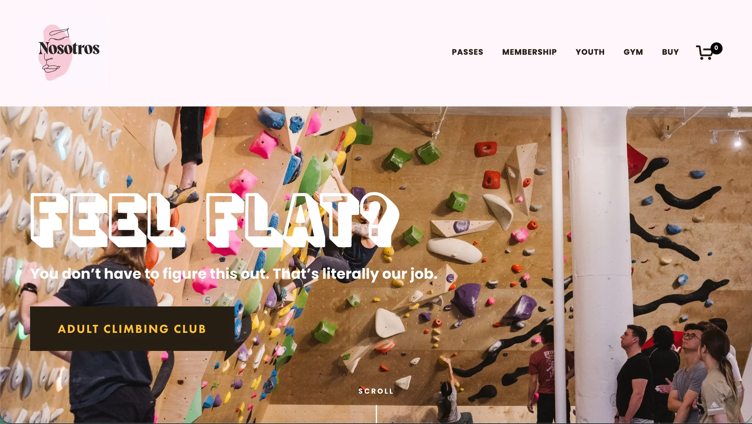
Nosotros takes a playful, conversational approach to fitness branding. Unconventional headlines, casual language, and real climbing photography make the website feel unmistakably different from standard muscle-and-motivation gym templates. The site's personality fits a climbing-and-weights community where participation and belonging are central to the experience.

Underneath that personality are clear ways to try the gym: visitor passes, memberships, climbing clubs, and first-visit guidance. Newcomers can learn about the waiver, get a pass, and know what happens when they arrive. That practical journey is important because a fun-looking website should still answer the questions that prevent a first visit.

04

EVERYBODY

Community Fitness & Wellness Gym

Visit Website →
Best Mission-Driven Brand & Inclusive Messaging
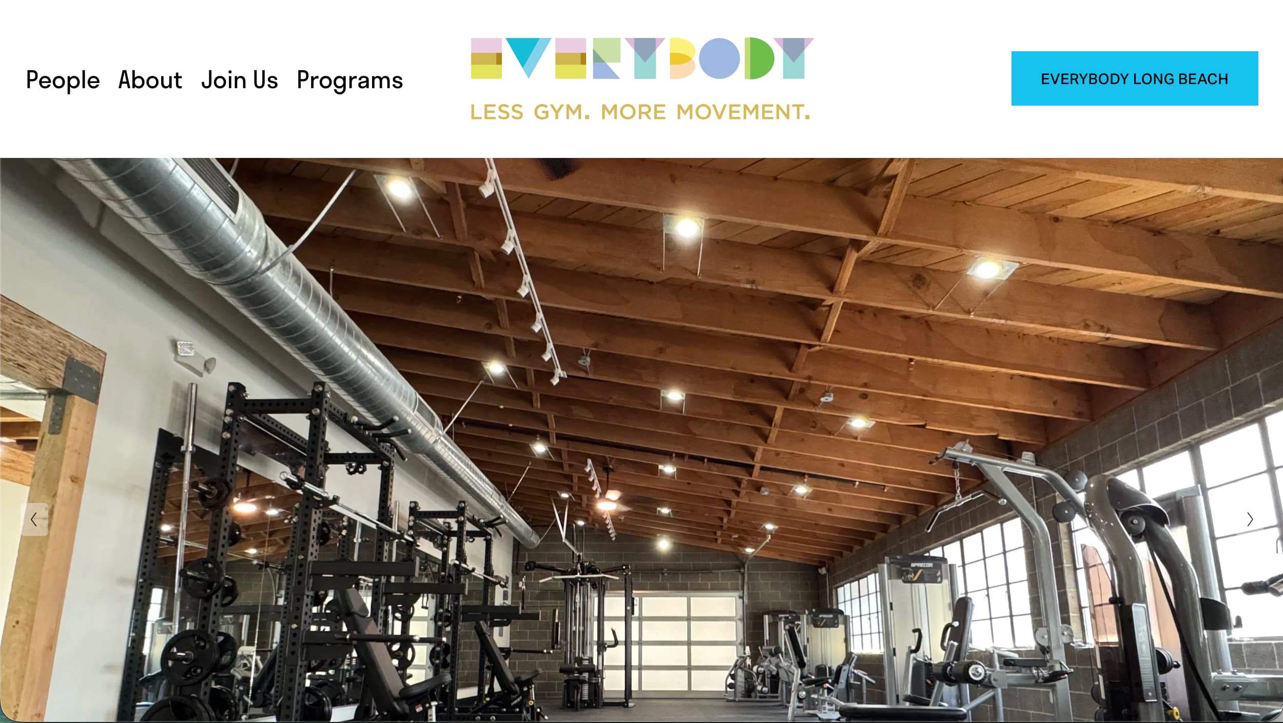
EVERYBODY gym website design example
EVERYBODY

Why it works

EVERYBODY builds its identity around a specific promise: a welcoming place for people with different bodies, backgrounds, and fitness needs. Its mission-led homepage, energetic member imagery, and direct language communicate why the gym exists, not just what equipment or classes it offers. This makes the brand more memorable than a generic feature list.

Practical navigation connects visitors to pricing, classes, personal training, wellness programs, and the Los Angeles and Long Beach locations. The website also makes its accessibility information and mission easy to find. By linking the brand's values to real programs and visitor information, the site shows how a gym can make its point of view tangible.

05

Paragon Gym

Boutique Strength & Personal Training Gym

Visit Website →
Best Boutique Luxury & Private Training Positioning
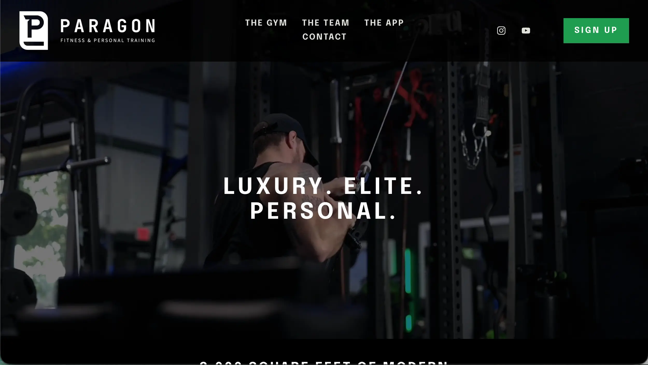
Paragon Gym gym website design example
Paragon Gym

Why it works

Paragon Gym presents a small, premium training environment through professional photography, minimal navigation, and focused messaging about personal service. The website highlights its modern training space, specialized equipment, private entry, and amenities without overwhelming the visitor with dozens of generic fitness claims.

Founder expertise and member testimonials add useful context to the premium positioning. Instead of trying to compete with large gyms on the number of locations or low membership fees, Paragon explains the quality of the space and the personalized experience members can expect. The result is a distinctive approach for a boutique training business.

06

HYPE Fitness

Neighborhood Group Fitness Studio

Visit Website →
Best Energetic Studio Branding & Class Discovery
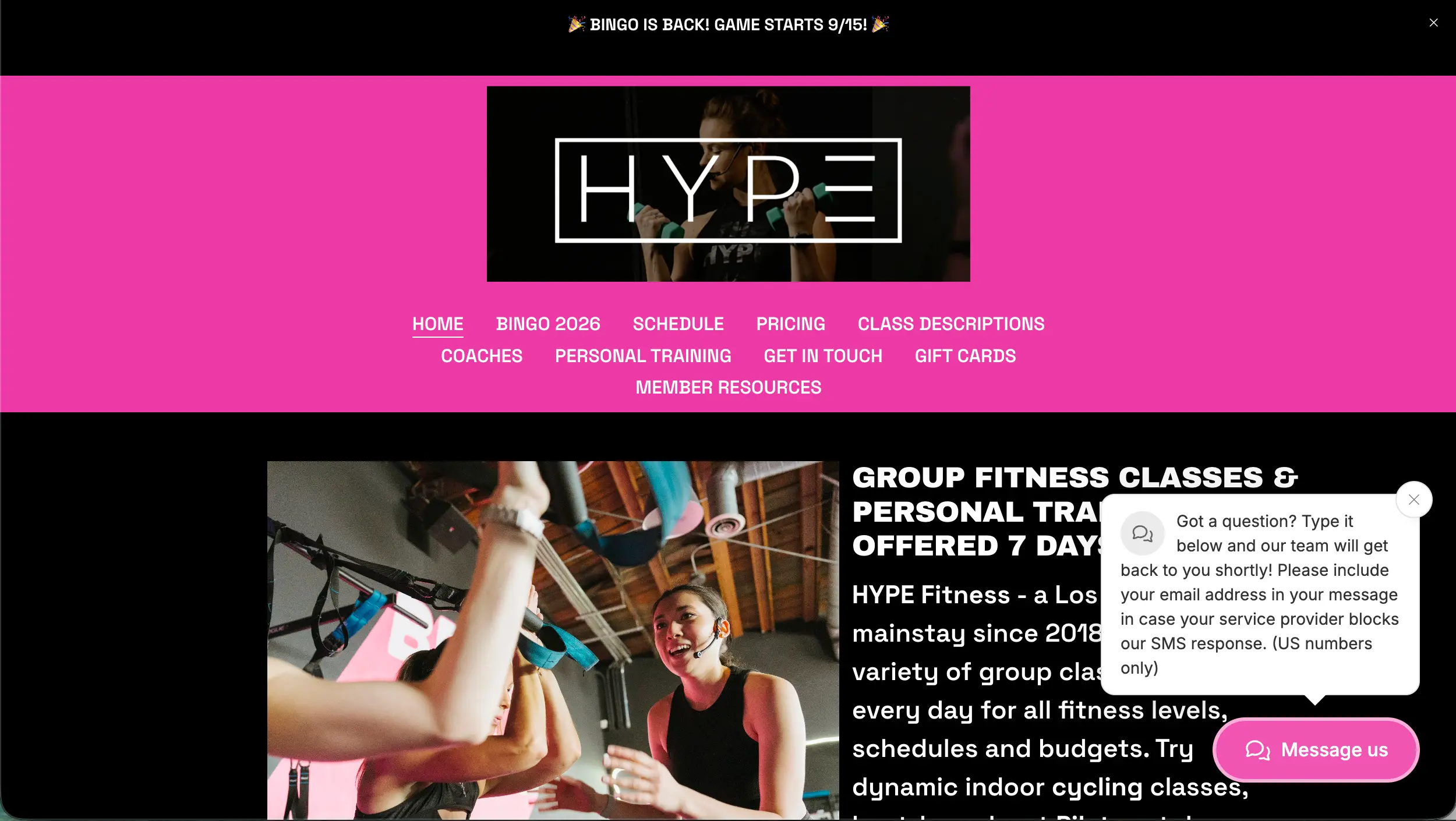
HYPE Fitness gym website design example
HYPE Fitness

Why it works

HYPE Fitness makes a varied class offering feel approachable. The Silver Lake studio introduces indoor cycling, Pilates-style classes, circuit training, yoga, and personal training through upbeat messaging and prominent getting-started links. Its friendly language emphasizes a neighborhood community over an intimidating performance culture.

A dedicated schedule and class descriptions allow visitors to explore formats and find a suitable session. The website also answers practical first-visit questions about schedules, parking, booking, and what a beginner should expect. This mix of energetic presentation and concrete information suits a studio where many customers will book a class before ever seeing the facility.

07

Rain City Fit

Independent Strength & Conditioning Gym

Visit Website →
Best Transparent Membership Pricing & Local Identity
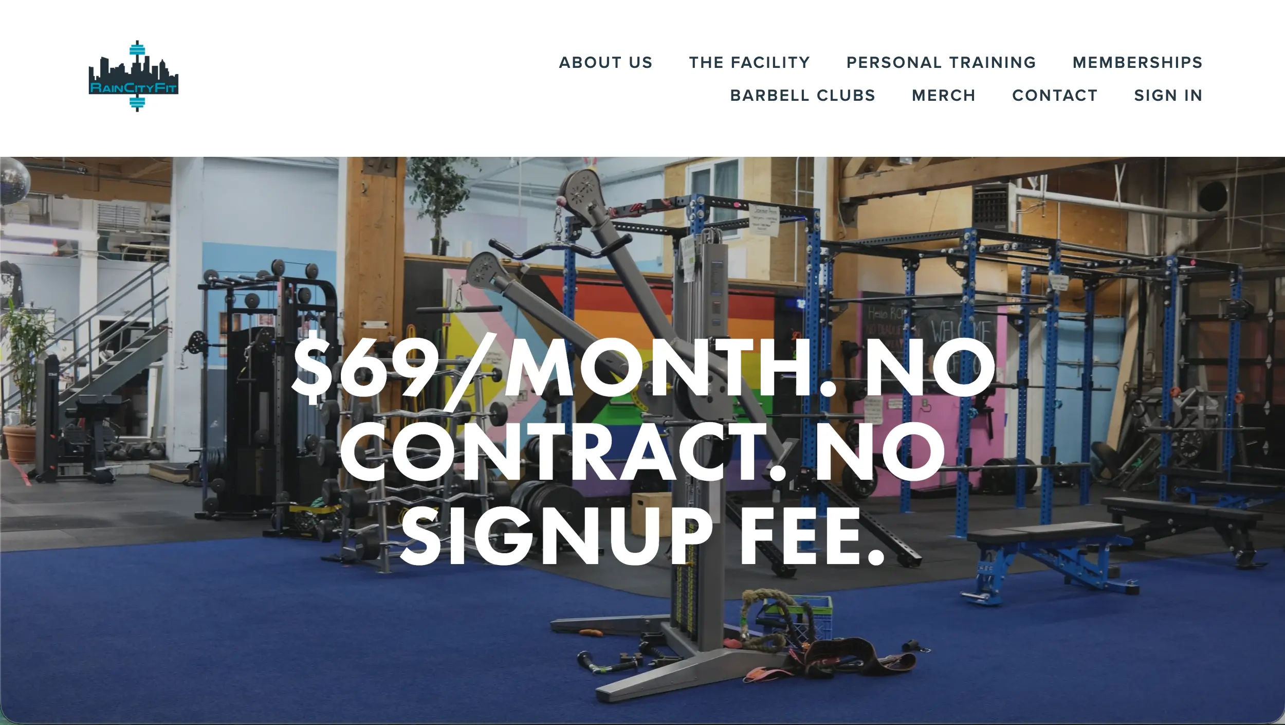
Rain City Fit gym website design example
Rain City Fit

Why it works

Rain City Fit stands out for how quickly it answers the questions prospective members actually have. The homepage puts a monthly membership price and straightforward contract language near the top, then explains the facility, equipment, access hours, and what is included. This is a practical approach that reduces the need to email or call for basic information.

The site supports that offer with genuine gym photography, descriptions of its training equipment, and clear links to passes and membership options. Its Seattle neighborhood identity also comes through in the presentation. It proves that a gym website can be effective without elaborate animations when the information architecture is centered on what visitors need to decide.

08

Portland Strength Collective

Member-Owned Functional Fitness Gym

Visit Website →
Best Member-Owned Community Storytelling
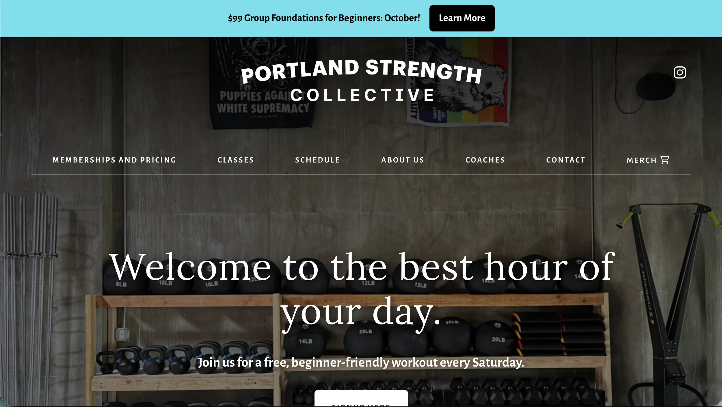
Portland Strength Collective gym website design example
Portland Strength Collective

Why it works

Portland Strength Collective has a compelling story that the website explains rather than burying in an About page. The gym was started by members who wanted more say in the space where they trained, and that collective approach informs how it presents community, coaching, and decision-making. A free Saturday workout makes the invitation feel immediate.

Newcomers can explore Foundations training, strength and conditioning, Olympic weightlifting, yoga, open-gym sessions, and detailed membership choices. The site distinguishes between beginner onboarding and drop-in options for experienced athletes, which prevents a complicated program menu from becoming confusing. Its value comes from specificity and real community substance.

09

The Bunker Gym

Powerlifting & Strongman Gym

Visit Website →
Best Strength Gym Positioning & Free-Pass Funnel
The Bunker Gym gym website design example
The Bunker Gym

Why it works

The Bunker Gym immediately establishes its niche with blunt headlines, lifting-focused photography, and straightforward language for powerlifters and strongman athletes. Its hero combines a strong identity with an invitation to take a free first visit. Visitors know what the gym is about and what to do next almost immediately.

The website also publishes simple membership information, highlights round-the-clock member access, explains equipment and the gym culture, and introduces its coaching. Beginners are explicitly welcomed alongside experienced lifters. That balance helps the brand remain specialized without making the training environment seem inaccessible to someone new.

10

Compound Gym

Performance & Strength Training Gym

Visit Website →
Best Equipment & Facility Showcase
Compound Gym gym website design example
Compound Gym

Why it works

Compound Gym turns its facility into a browsable selling point. The Houston website breaks the gym into specific training zones, including powerlifting platforms, dumbbells, lower-body machines, a posing room, infrared saunas, and upper-body equipment. Visitors can picture what is inside instead of having to infer everything from a single wide-angle room photo.

The site then supports those facility details with membership and day-pass links, around-the-clock access information, coaching, and equipment-brand references. This level of detail is especially helpful for serious lifters who compare facilities based on the equipment they can actually use. The design lesson is to organize amenities around members' real priorities.

What We Learned

What the Best Gym Websites Have in Common

The strongest gym websites express a clear personality while making it easy to understand the training experience, compare memberships, find a class, and take the first step.

First-Visit Path

Tour, trial pass, class, or consultation links should give new visitors a clear next step without forcing a phone call.

Membership Clarity

Explain plans, access hours, inclusions, and conditions so people can understand the offer before joining.

Real Facility Images

Show training spaces, equipment, classes, and members so prospective customers can imagine using the gym.

Training Specialization

Make it obvious whether your gym focuses on powerlifting, functional fitness, coaching, climbing, or general wellness.

Coaches & Community

Introduce trainers, explain the culture, and show genuine member experiences to build trust.

Practical Local Details

Include your address, directions, schedule, accessibility information, and what to bring to the first session.

Building Your Own?

How to Build a Gym Website Like These

A successful gym website should show visitors what makes the training experience different and make joining or trying a class feel straightforward. Start with the gym's identity, then support it with specific information and clear next steps.

1

Define Your Gym's Niche

Decide what visitors should remember: serious strength training, inclusive community, personal coaching, distinctive classes, or premium facilities.

2

Show the Space and People

Use real images of training zones, equipment, coaches, classes, and members. Let visitors preview the environment before their first visit.

3

Explain Programs and Pricing

Organize classes, personal training, memberships, hours, and what plans include. Provide a clear route to detailed terms.

4

Make Trying the Gym Easy

Offer a prominent first action such as Book a Tour, Try a Free Class, Get a Day Pass, or Schedule a Consultation.

Website Structure

What Should a Gym Website Template Include?

A gym website template should help prospective members picture the training experience, understand the offerings and costs, meet the coaches, and take a simple first step toward visiting.

01

Clear Hero & Call to Action

Lead with a real gym or training photo, a concise positioning statement, and a prominent tour, trial, or membership button.

02

Programs & Classes

Explain training styles, difficulty levels, schedules, and whether newcomers need a foundations or introductory session.

03

Memberships & Passes

Show plans, prices or pricing paths, trial offers, what is included, and any important contract details.

04

Facility & Equipment Gallery

Show training zones, machines, free weights, recovery amenities, and actual spaces members will use.

05

Coach Profiles & Social Proof

Introduce trainers, credentials, testimonials, and member stories without resorting to unrealistic promises.

06

Locations, Hours & Contact

Provide an accurate address, map link, operating hours, entry instructions, and mobile-friendly contact options.

Before You Launch

Gym Website Checklist

Use this checklist when creating a new gym website or reviewing an existing one.

The homepage clearly explains the gym's specialty and who it serves
A trial pass, tour, class, or consultation call to action is easy to find
Membership plans or a transparent pricing path are available
Hours, address, directions, and contact details are easy to access
Real facility and equipment photographs are included
Classes, personal training, and other programs are clearly explained
Trainer credentials and authentic member testimonials are available
First-time visitors can find what to bring and how to get started
Membership terms and cancellation policies are easy to locate
The site and booking process work well on mobile devices

Frequently Asked Questions

Gym Website Design FAQs

What should a gym website include?

A gym website should include its training programs, membership options, location, opening hours, real facility photographs, trainer information, contact details, and a clear first step such as booking a tour, trial class, or day pass.

Should a gym show membership prices on its website?

For most gyms, showing prices or at least a clear starting price helps visitors compare options and understand the commitment. If plans are customized, explain what affects the price and provide an easy way to get the details.

How can a gym website attract new members?

Lead with a clear promise, real gym photography, testimonials, beginner-friendly information, and an obvious call to action. Trial classes, tours, or a paid day pass can help visitors experience the gym before deciding on membership.

What photos work best on a gym website?

Use authentic images of the facility, training areas, equipment, coaches, classes, and members when appropriate. Show the experience honestly and avoid relying entirely on generic stock images or unrealistic transformation pictures.

What is a good call to action for a gym website?

Effective calls to action include Book a Tour, Try a Class, Get a Day Pass, View Memberships, See the Schedule, and Book a Free Consultation. The best choice depends on how your gym actually welcomes new members.