Website Examples

10 Dentist Website Examples & Design Ideas

Looking for inspiration for a dental practice website? These real dentist websites show different ways to build trust, simplify booking, present services, reduce patient anxiety, and create a memorable dental brand.

Quick Take

What Makes a Great Dentist Website?

01

Clear Booking

Visitors shouldn't have to search for the phone number, appointment form, or booking button.

02

Real Trust Signals

Reviews, dentist bios, credentials, and real practice photography help patients feel confident.

03

Useful Service Pages

Patients should quickly understand which treatments the practice provides and where to learn more.

04

A Distinct Identity

The best dental sites feel like a specific practice rather than a generic healthcare template.

Real-World Inspiration

Dentist Website Examples Worth Studying

We chose these examples because each demonstrates something different. Some excel at branding, others at booking, patient experience, specialization, or conversion. The goal isn't to copy them, but to understand what each one does especially well.

01

Grand Street Dental

General & Cosmetic Dentistry

Visit Website →
Best Editorial Branding
Grand Street Dental website homepage example
Grand Street Dental

Why it works

Grand Street Dental looks more like a premium lifestyle or editorial brand than a traditional dentist website. Strong photography, spacious layouts, and confident typography give the practice a distinctive identity immediately.

The visual presentation supports the idea that dental care can be a considered part of personal wellness and appearance rather than simply a clinical necessity.
02

Tend

Multi-Location Dentistry

Visit Website →
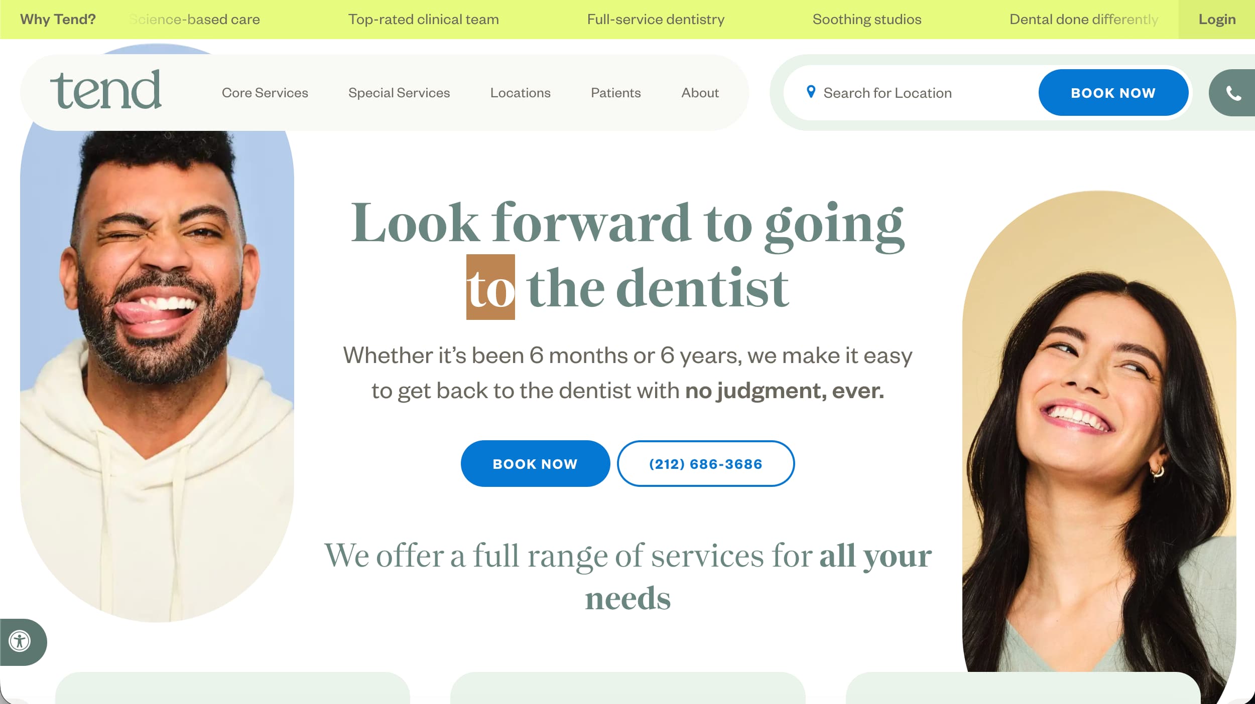
Best Booking Experience
Tend dental website homepage example
Tend

Why it works

Tend treats online booking as a core part of the website rather than something hidden behind a contact page. Location selection, appointment availability, services, insurance information, and patient questions are all integrated into a clear customer journey.

It is a useful example of how a larger dental business can still feel approachable while handling the complexity of multiple locations.

03

Zen Dental Studio

General & Cosmetic Dentistry

Visit Website →
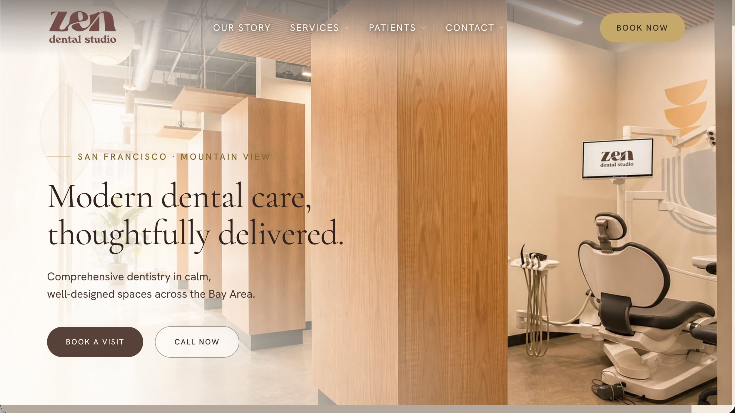
Best Patient Experience Design
Zen Dental Studio website homepage example
Zen Dental Studio

Why it works

Zen Dental Studio builds its entire website around the idea of a calmer dental experience. The visual design, language, office amenities, treatment presentation, and patient information all reinforce that promise.

It also does a strong job organizing practical information such as services, technology, costs, and insurance without making the experience feel cluttered.

04

Dental Design SD

Cosmetic & General Dentistry

Visit Website →
Best Overall Independent Practice
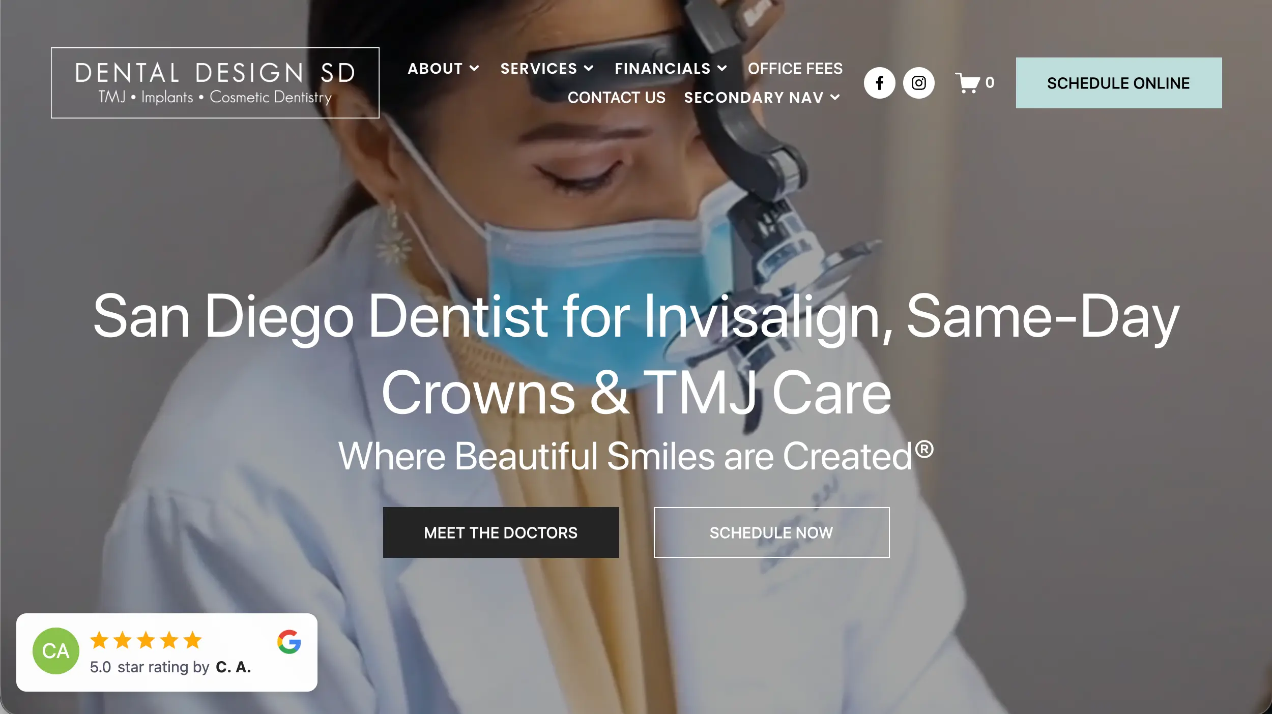
Dental Design SD website homepage example
Dental Design SD

Why it works

Dental Design SD balances branding, credibility, service information, and conversion particularly well. The practice itself remains the focus rather than letting the site become a generic collection of dental imagery.

Reviews, treatment information, photography, and clear appointment paths work together without making the page feel overloaded.

05

The A.B.C. Smile

Cosmetic & Restorative Dentistry

Visit Website →
Best Bold Branding
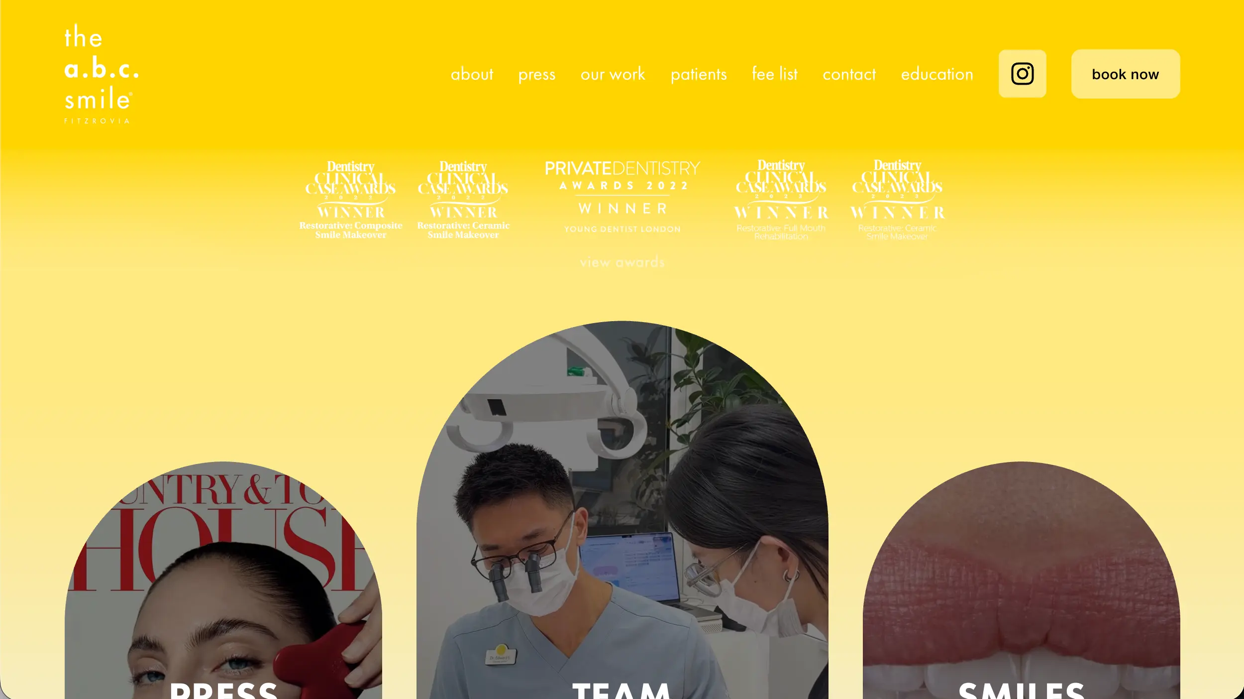
The A.B.C. Smile dental website example
The A.B.C. Smile

Why it works

The A.B.C. Smile demonstrates that dentist websites don't have to rely on the familiar blue-and-white healthcare aesthetic. Strong colors, distinctive shapes, expressive photography, and confident typography make the brand memorable.

Despite the bold presentation, the important information remains accessible, so the site's personality doesn't come at the expense of usability.

06

Dentologie

Multi-Location General Dentistry

Visit Website →
Best Multi-Location Website
Dentologie dental website homepage example
Dentologie

Why it works

Dentologie communicates the advantages of a larger dental organization without making the experience feel corporate. Locations, insurance, pricing, reviews, treatments, and booking are presented as practical answers to common patient questions.

The brand also uses friendly language and a modern visual system to make routine dentistry feel more approachable.

07

Gentry Dentistry

Cosmetic & Implant Dentistry

Visit Website →
Best Luxury Design
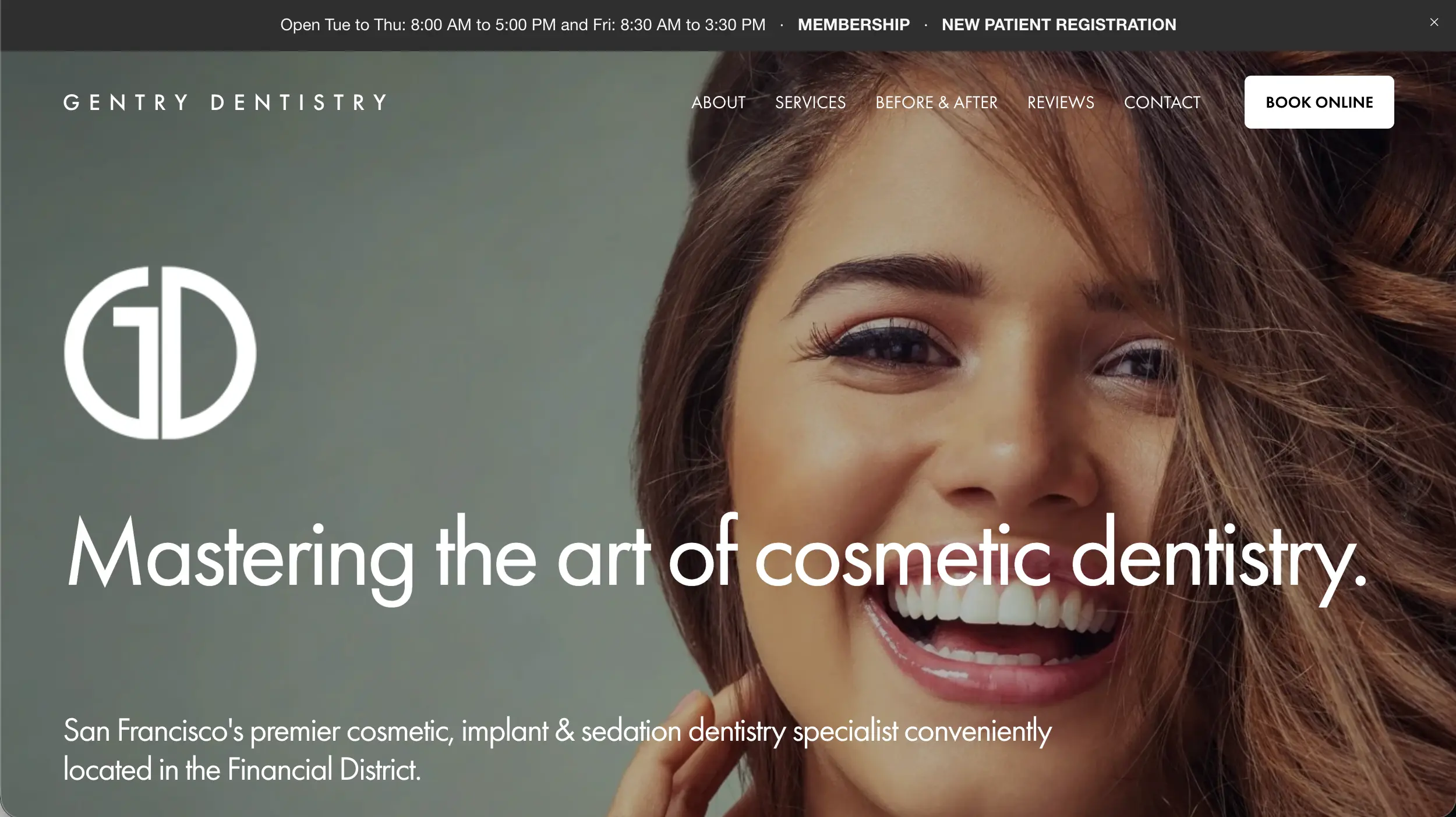
Gentry Dentistry website example
Gentry Dentistry

Why it works

Gentry Dentistry presents dental care more like a premium lifestyle service than a traditional medical office. Large imagery, restrained typography, generous spacing, and polished presentation create an upscale first impression.

That positioning makes particular sense for a practice focused heavily on cosmetic dentistry and higher-value smile treatments.

08

BEAM Pediatric Dental Studio

Pediatric Dentistry

Visit Website →
Best Pediatric Website
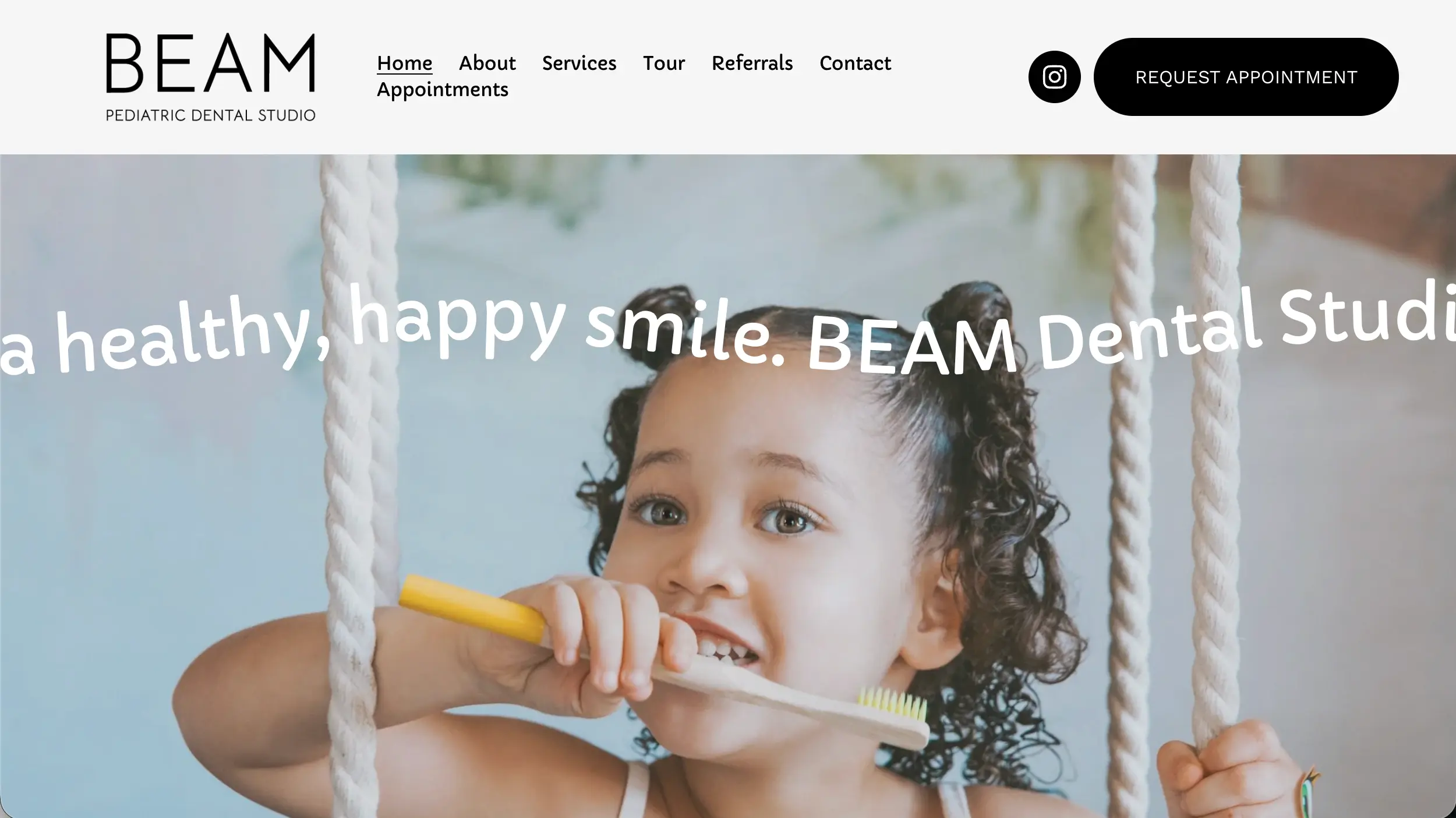
BEAM Pediatric Dental Studio website example
BEAM Pediatric Dental Studio

Why it works

Pediatric dentistry has to appeal to parents making the decision while also creating a welcoming impression for children. BEAM manages both without making the design feel overly childish.

Friendly branding and photography communicate a kid-focused experience while the overall site remains polished and credible for parents.

For more specialized inspiration, see our Pediatric Dentist Website Examples for additional ideas focused specifically on children's dental practices.

09

Austin Dental Company

Cosmetic & General Dentistry

Visit Website →
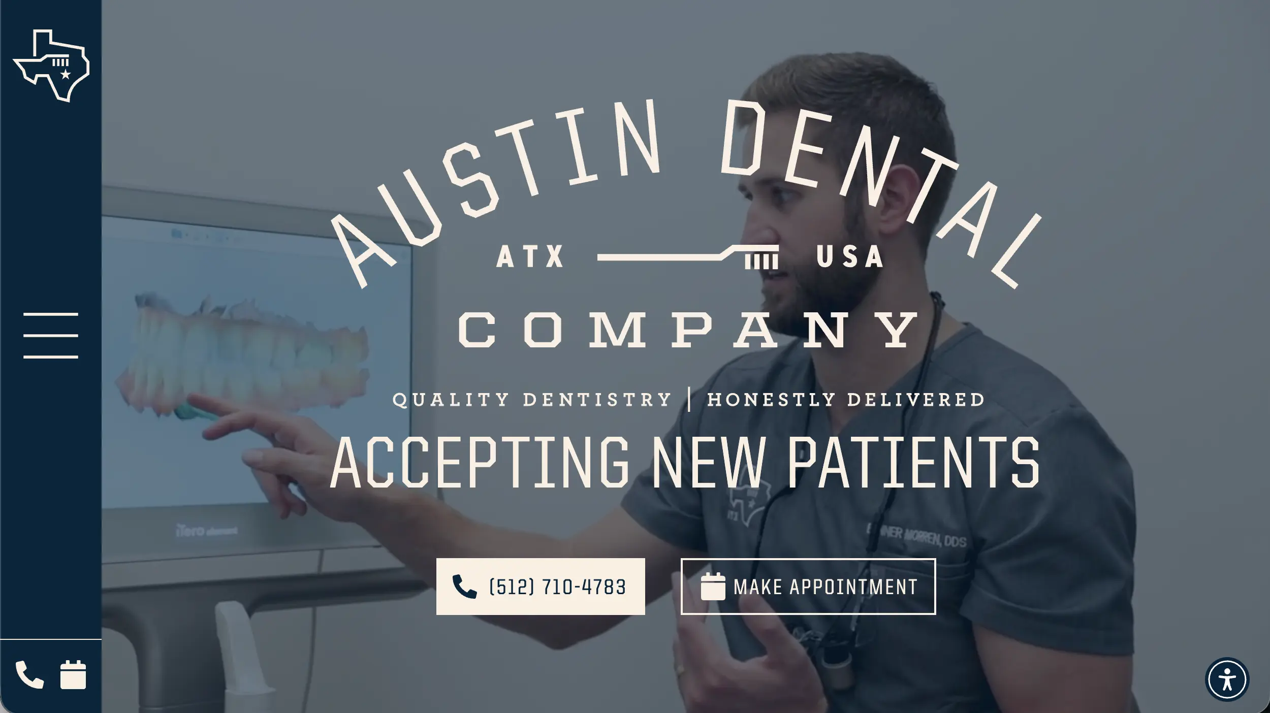
Best Virtual Consultation
Austin Dental Company website example
Austin Dental Company

Why it works

Austin Dental Company offers prospective patients a virtual consultation path rather than requiring every interested visitor to immediately schedule an in-office visit.

That is particularly useful for cosmetic dentistry, where visitors may still be researching possibilities and aren't ready to commit to a traditional appointment.

10

Prism Oral Surgery

Oral Surgery & Dental Implants

Visit Website →
Best Specialist Website
Prism Oral Surgery website example
Prism Oral Surgery

Why it works

Oral surgery can feel intimidating, so Prism avoids making the site overly clinical or technical. The restrained presentation helps the practice communicate specialist expertise without unnecessarily increasing patient anxiety.

It is a strong example of how the appropriate website experience changes depending on the type of dental care being offered.

For more specialist-focused inspiration, explore our Oral Surgery Website Examples for additional examples centered on surgeon credentials, patient education, referrals, and consultation paths.

What We Learned

What the Best Dentist Websites Have in Common

These websites look very different from one another, but the strongest examples tend to solve the same basic problems for prospective patients.

An Obvious Appointment CTA

Someone ready to become a patient shouldn't have to search through the site to figure out how to schedule. Keep a clear appointment action visible.

Real Practice Photography

Photos of the actual dentists, staff, office, and patient experience usually communicate more trust than interchangeable stock photos.

Easy-to-Find Services

Visitors often arrive with a specific need. Make treatments such as implants, Invisalign, cosmetic dentistry, cleanings, or emergency care easy to locate.

Reviews and Trust Signals

Reviews, credentials, experience, professional affiliations, and other trust signals can reduce uncertainty for patients comparing local practices.

Clear New-Patient Information

Insurance, financing, forms, location details, scheduling expectations, and first-visit information answer questions that might otherwise prevent someone from booking.

A Mobile-Friendly Experience

Phone numbers, navigation, appointment buttons, and forms should remain easy to use on a small screen. Excellent desktop design doesn't help if mobile visitors struggle to take action.

Building Your Own?

How to Build a Dentist Website Like These

You don't need to copy one of these websites. Instead, borrow the parts that fit your practice: clear structure, strong photography, visible trust signals, useful service information, distinctive branding, and an easy path to booking.

1

Choose Your Platform

Decide whether you want WordPress, a hosted website builder, or a professionally built custom website.

2

Define Your Main Goal

For most dental practices, the website's primary job is turning prospective patients into booked appointments.

3

Build the Essential Pages

Start with your homepage, services, dentists and team, new-patient information, reviews, contact information, and appointment page.

4

Use Real Photos

Good photography of your actual office, dentists, and team can make even a relatively simple website feel substantially more credible.

Before You Launch

Dentist Website Checklist

Use this as a quick starting point when planning or reviewing a dental practice website.

Practice name and location are immediately clear
Appointment button is easy to find
Phone number is visible on mobile
Main dental services have dedicated information
Dentist and team information is easy to find
Reviews or testimonials are visible
Insurance and financing information is available
Real office photography is used where possible
Address, hours, and contact information are accurate
The entire site works well on phones

Frequently Asked Questions

Dentist Website Design FAQs

What should a dentist website include?

At minimum, a dental website should clearly explain the practice's services, introduce the dentists and team, provide location and contact information, explain how new patients can get started, and offer an obvious way to request or book an appointment.

What makes a dental website look trustworthy?

Real team and office photography, clear dentist credentials, patient reviews, accurate contact information, transparent service information, consistent branding, and a polished mobile experience all help establish trust.

Should a dentist website allow online booking?

If the practice has a scheduling system that supports it, online booking can make the next step easier for prospective patients. Practices that don't offer direct scheduling should still provide a prominent appointment request form and phone number.

Should dentists use stock photos on their websites?

Stock photography can fill occasional gaps, but original photos of the dentists, team, office, and patient environment generally make the site feel more authentic and specific to the practice.

What colors work best for dentist websites?

There is no required dental color palette. Blues, greens, and neutrals are common because they can feel calm and clean, but several strong dental brands use warmer or much bolder colors. The most important thing is consistency with the practice's overall brand and audience.